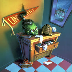
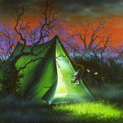
READER BEWARE: This is my blog, so everything I say here is my opinion. I'm not going to end every sentence "in my opinion" or anything like that. If you have your own thoughts on these covers, please leave them in the comments below.
In this series of blogs, I'll be reviewing each Goosebumps series' cover art. For this one, I will be taking a look at the Classic Goosebumps series. Classic Goosebumps is a book series that re-releases older Goosebumps books with brand new artwork. The art is done by an artist named Brandon Dorman. He usually does fantasy-type artwork, which range from cartoony, to detailed and realistic. I must say, he's a very good artist. He's done a lot of book covers, but none of them were really horror based. So Goosebumps is a bit different for him. So how does is fantasy style transition to Goosebumps? I think it's time we find now.
Before I get started, I must explain how I critique the artwork. Pretty much, I'm going to compare them to the original Goosebumps series artwork, which was mainly done by Tim Jacobus. The original series artwork ranged from charming, creepy, eerie, cool, and scary. They have this realistic and dream-like flare, the colors are really saturated, and some of the artwork has the floor or ceiling warping. The original series artwork is timeless, and will creep anyone out at any age. For example, I have this Night of the Living Dummy cardboard stand with the original artwork, which I have sitting up on my bookshelf. One day, my dad walked in my room and saw it. He said to me, "That is the creepiest I have ever seen." So I'll be judging these covers based on how creepy/scary they are, and how they stack up to the original series. Alright. Now let's begin...
(Classic editions are displayed on the left, original artwork is displayed on the right.)
Ranking system:
#1: Night of the Living Dummy
This is the first cover in the Classic Goosebumps series. The first nine covers didn't mimic the original series' artwork, and are completely unique. Which, I think is a good thing. This cover is very different compared to the original. Instead of a close-up of Slappy's face, it's a shot of him slumped on a shelf(?). And here we see our first problem with the series; Dorman seems to think giving the main villain on the cover angry eyes makes it scary. It... really doesn't. Just look at the original artwork for Night of the Living Dummy. Was Slappy angry in that? No. In fact, his eye brows were raised up. What made that artwork creepy was his smile, his yellow eyes staring intently at you, and the lighting. He didn't need to look angry. In fact, if he did, it would probably ruin it. All there Living Dummy covers in the original series didn't have Slappy, or any other dummy look angry, and yet, they were still creepy.
That all being said, I don't hate this cover. But I honestly think if he didn't look angry, and all he had was a creepy smile, this would have been creepy. I also don't like how Slappy doesn't have that much detail going on. He appears too plastic-like. Although, I do like innocent kids drawings on the wall. Despite my criticisms, I think this cover is good in its own right.
 - Decent, but I can really do without the angry eyes.
#2: Deep Trouble
The original artwork for Deep Trouble, gave you a great sense of danger. You have some kid floating in the water, completely unaware of this hammer-head shark about to attack him. It's terrifying. So how does this new version by Brandon Dorman stack up compared to it? Not much. That sense of danger you got from the original is not present here. Instead, you have the hammer-head shark just casually swimming through the water, with some skull structure behind him. Since there is no kid or anything like that in the water, there's no reason to be scared by this. It's just a shark swimming around.
 - Doesn't capture the same dangerous vibes as the original.
#3: Monster Blood
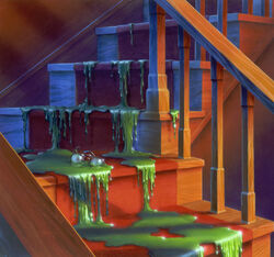
The artwork here more resembles a scene from the book (although, I don't remember the Monster Blood being described as a giant blob with arms and an angry face). There's some nice attention to detail going on, which is always a plus. However, this cover is not creepy. The original cover for Monster Blood is probably one of the most creepiest in the original series. The lighting, the way the monster blood flows and drips down the stairs, and the glasses being caught up it in gives the cover a very eerie feel. The Classic version does not capture the same vibe. But that's fine. I just wish it were scarier. Maybe if the two bullies from the book were caught inside the Monster Blood, then maybe it would have been more scary. I don't know. But overall, it's not bad. It's fun to look for all the objects inside the Monster Blood.
 - Decent, but could be scarier.
#4: The Haunted Mask
I like how this takes place at night, and everything is red. The atmosphere for this cover is great. However, my main problem with the cover is The Haunted Mask itself. It's not the highlight of the cover. It's just kind of... there. The kids aren't even scared by it. They're just walking away. Also, is the kid wearing The Haunted Mask supposed to be Carly Beth? Because it doesn't look like her, nor does it look a girl.
While I do like the red color scheme of the cover, I really don't like how there isn't a focus on the mask itself. The original artwork for The Haunted Mask was smart, in that the highlight of the cover is the mask. And once again, this cover is not creepy, especially when the artwork takes place on Halloween, making the mask appear less effective.
 - Nice atmosphere, but the mask not being the highlight of the cover bothers me.
#5: One Day at HorrorLand
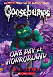
The original series artwork took place by the welcome sign, but this one actually takes place in HorrorLand itself. And as you guessed it, it's not creepy nor is it scary. The Horror at the ice cream stand doesn't look threatening. In fact, I don't like this shot at all. Why does this cover even take place at the ice cream stand? Out of all the locations in HorrorLand, Dorman chose this? I don't get it. I think it would've been better if we got a shot of a Horror (that looks creepy and/or threatening) standing behind something, and you see the family walking by. That would've been good. But no. Ice cream. Actually, the ice cream is the scariest part of the cover.
 - Blah. Needs to be completely redone to satisfy me.
#6: The Curse of the Mummy's Tomb
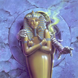
Compared to the original, there's much more detail going on. And despite the mummy looking kind of threatening, I don't think it's scary or creepy. Geez, have I said that for every cover so far? Dorman needs to step up his game! But anyway, there's not much else to say about it. I don't care for it, nor did I care for the original that much either. I guess I'm just not a fan of mummies?
 - Another cover that isn't scary/creepy. Only would I consider it "mildly threatening".
#7: Be Careful What You Wish For
The original cover is pretty ominous. Not exactly creepy or scary, but ominous. And that's fine. But what about this one? We have this lady in a psychic ball. Looking at this artwork from a distance makes it look like she doesn't have pupils, and it looks kinda creepy. However, once you do take a closer look at the cover, you'll she that she does in fact have pupils. And she doesn't even look scary.
It's best to view this cover from a distance.
None of these covers have blown me away so far, and they only seem to be getting worse. There's gotta be at least one amazing cover. One that's just as good as the original artwork. Right?
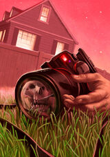
#8 Say Cheese and Die!
And here it is! Man, is this incredible. I-it's actually... scary. Actually, no, it's disturbing. Yeah, I can't believe it either. We have this camera in a lifeless person's hand (presumably someone who just died). And in the reflection of the camera lens, we see a skull (which is a callback to the original art). This is very dark for a Goosebumps cover, and I love it. In fact, I like it just as much as the original. It's creepy, eerie, and as I said, disturbing. I also like the red color scheme. Although, if there's one complaint I have with it, is that the sky is a bit too bright.
 - An actual creepy cover that nails it in almost all aspects.
Unfortunately, things don't go up from here.
#9: The Horror at Camp Jellyjam
Oh boy. Let's talk about the original artwork first. It's just this one creepy guy standing in front of the shot giving this... very creepy smile, and he's staring into your soul. There's an empty camp ground with no kids in sight behind him, and some evil, dark looking clouds. The cover as a whole is very off-putting, and gives me goosebumps. So how does the Classic version compare? Well, take everything good and creepy about the original, and throw it out the window. This is not creepy in the slightest. It takes place in broad day light, with light shining in. It looks more peaceful than scary. This cover did not give me goosebumps.
 - Purple Monster Blood with a crown in a peaceful cave in broad day light is, surprisingly, not scary.
#10: How I Got My Shrunken Head
I didn't think the original cover was scary, so this doesn't have to do much to be good. In the original cover, the Shrunken Head was staring off, giving it feeling that it has a mind of its own. But the Classic version just looks like a toy. It doesn't have rips or stitches or anything. This didn't have to do much to be good, but still ends up failing.
 - The Shrunken Head here is just a worse looking version of the original.
#11: The Werewolf of Fever Swamp
This is the cover where Dorman started making knock-off versions of Jacobus' original artwork. The original artwork only had Will Blake turning into a wolf, and not a werewolf. Dorman decided to fix this, and made him turn into a werewolf instead. Honestly, this is not a bad cover. I like the pure white eyes and the mouth. However, I think the werewolf design is a bit too simplistic. If the design of it was a little less generic, and had a bit more detail, then this cover would've probably been pretty good. But overall, the artwork doesn't do too much wrong. I could see someone thinking the mouth and eyes are scary, so I'll be generous give this one a green.
 - Doesn't do too much wrong, but the werewolf design could be better.
#12: A Night in Terror Tower
And so begins the artwork trying too hard to be threatening/scary. Look at the original art. The Lord High Executioner is walking down a narrow stairway weilding an axe, and he's got those creepy eyes. It's very simple, but very threatening and scary. In the Classic version, there's fire, pointy gates, the Lord High Executioner is wearing spiky bracelets on his arms and legs, and he's wielding an axe. All of that, and the cover is hardly scary. In the original art, it looks like the Lord High Executioner is chasing you down. Here, it looks like he's welcoming you or something. Also, in the original art, the Executioner has darkness behind him. Here he has light behind him.
 - Tries to be threatening in a lot of ways, but doesn't exceed at it.
#13: Welcome to Dead House
This looks way too similar to the original art. It even has the exact same color scheme, and the same figure looking out the window, but the only difference here is that it's a kid instead of a man. I also think the background is a bit too bright. This isn't bad at all, but it's too similar to the original, and doesn't really add anything new.
 - Cheap imitation of the original cover.
#14: Welcome to Camp Nightmare
I'm going to be blunt here and say it; this is my least favorite cover in the Classic series. Before I explain why I think it's the worst, let's go over the things I do like about it. There's a lot of detail going on. I like the dead trees, and the murky color scheme. It's all great... until you get to the monster. The original art was smart. Instead of showing you the monster, it's hidden away. The only thing you can see are its creepy eyes, and weird looking, human-like hand. It's very eerie. The Classic cover, however, is not. Not even in the slightest. The monster here is actually shown, and honestly, it looks horrible. It's generic, and looks like something you'd see on the cover to a nursery rhyme book. And once again, the artwork here is just a cheap (and inferior) imitation of the original. This cover had a lot going for it, but the monster completely ruins it.
 - Yet another cheap imitation of the original. It's not creepy and the monster design is horribly generic.
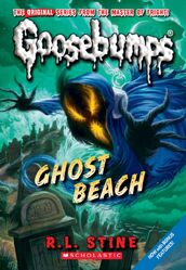
#15: Ghost Beach
Yikes. This one tries way too hard. The ghost's design is ridiculous. It's got this purple cloth on it, some broken chain (what?), and its face... ohhh its face. The face is so over the top and over done. Its eyes and mouth are so exaggerated, and same with its hands. The scenery is okay, and I don't really care for the color scheme. Overall, this one is very poor.
 - Bad ghost design, bad cover.
#16: The Scarecrow Walks at Midnight
I like how this one takes place in a windy cornfield. I also like the way the sky looks. The design of the scarecrow's face looks like a jack-o'-lantern, so this one's got some Halloween vibes going on. I wouldn't say this one is creepy or scary, but the art here is pretty cool, and it's a lot better than the previous covers.
 - Some nice Halloween vibes with this one.
#17: You Can't Scare Me!
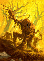
The title is right. This cover can't scare me! While the original was nice and subtle (and actually terrifying), the Classic version goes the Ghost Beach route, and tries way too hard. The Mud Monsters not having teeth or eyes in the original is kind of what made the original scary. But here, the Mud Monsters actually have teeth and eyes -- which makes them look completely un-scary. The Mud Monsters are also aggressively rising from the swamp, unlike the original, where they rose from the swamp slowly (which, again, made it all the more scary). And the Mud Monsters here are flinging lots of mud into the air. It's like Dorman thought to himself, "How can I make this as over the top and as exaggerated as possible?"
 - This cover is ridiculous, over the top, over done, and you guessed it -- not scary.
#18: Return of the Mummy
The design of the cassette (is that what it's called?) and the walls are a lot more detailed than the one from the original, which I like. I also like the lighting. This cover doesn't do too much wrong. However, once again, it's a blatant imitation of Jacobus' original artwork. I don't know why Dorman did this. The first nine or so covers were completely original. But now he's just looking off of Tim Jacobus' artwork, and drawing it in a different style. That may sound cool, but I rather him make his own art instead of mimicking others. It's just unnecessary, and kind of lazy. Also, why does the mummy here have claws?
Even though this is yet another imitation of Jacobus' original art, it's not a bad one. So I'll be generous and give it a green.
 - Despite being yet another blatant copy, I actually like the detail and lighting on this one more than the original.
#19: Revenge of the Lawn Gnomes
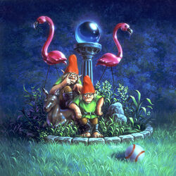
Honestly, I think the original art for Revenge of the Lawn Gnomes is one of the few artwork in the original series that wasn't creepy or scary. I think it was going for a more "mischievous" feel. The Lawn Gnomes on the cover give the impression that it's their lawn. The Classic version, instead of imitating the original, is completely different for once. You have three Lawn Gnomes that look like they're about to take over someone's lawn. This doesn't look like a Goosebumps cover at all. Dorman usually likes drawing old folklore creatures (goblins, trolls, etc.), so I think he got a little carried away with the designs of the Lawn Gnomes here. They just don't have that Goosebumps feel to them. Also, the scenery is too bright.
I don't hate this one, but I don't like it either, so yellow rating it is.
 - Doesn't feel or look like Goosebumps at all.
#20: Phantom of the Auditorium
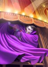
I didn't care too much for the original cover, and I don't care about this one either. But at least the original took place in front of some dark drapes, and the phantom's face and body was shadowy, making him look mysterious. This one takes place in a well-lit room, and the phantom's clothing is very bright. This is probably the only cover in the Classic series that doesn't even make an attempt at being creepy/scary/threatening.
 - Not creepy in the slightest. There's not even an attempt.
#21: Vampire Breath
You got Count Nightwing opening up his coffin from the inside, and staring at you with some pretty fierce eyes. I like Nightwing's design and the color scheme as well. Though, I wish there weren't so many cobwebs. It's way over done here. But overall, this one's not bad. But is it scary? Almost, so points for that.
 - A pretty decent cover, though I would tone down the cobwebs.
#22: Stay Out of the Basement
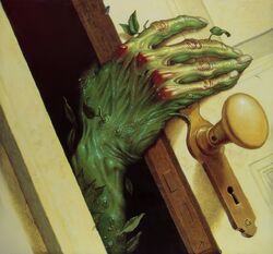
And now we're back to ripping off the original art. The original by Jim Theisn was simple, yet brilliant. You have this green, plant-like hand emerging from the darkness of the basement, holding onto the door. It's extremely eerie and creepy, and actually gives me goosebumps. This Classic version however, is neither of those things. And it doesn't give me goosebumps. This is so painfully unoriginal. Dorman just looked off the original, and added a bunch of vines. And by "a bunch", I mean way too many. Seriously, this is ridiculous. Just get rid of all the vines, and you got yourself an alright cover. But that still wouldn't change the fact this is a blatant copy of the original. When Tim Jacobus did the art for the 2003 reprint of Stay Out of the Basement, he didn't copy the original. He made his own art. Why didn't Dorman do the same?
 - Dangerous drinking game: Take a shot every time Brandon Dorman makes an inferior imitation of an original series cover.
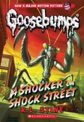
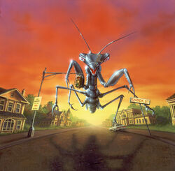
#23: A Shocker on Shock Street
This cover marks the return of the Classic series, which went on a 4 year hiatus for some reason (though, I wish it was permanent). This one is, once again, very similar to the original, even down to the same color scheme. However, there's some stuff I like here. I really like the sky. It's got that surreal Jacobus flare to it. The overall detail on the cover is nice too. The design for the mantis is alright. It's really trying to appear threatening. It's even dripping green stuff from its mouth. But I suppose it's not too over the top. All in all, this one is pretty solid.
 - This one's not that scary, but there's quite a lot to like here. This is the best cover since Say Cheese and Die!, which was 15 covers ago...
#24: Let's Get Invisible!
This cover doesn't do too much wrong. It's similar to the original, but the color scheme here is at least different. There's a lot of detail too. However, I wish the scene was a bit more more dark in terms of brightness. Also, the kid's arms. They're green for some reason. But overall, the cover is not bad.
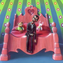
#25: Night of the Living Dummy 2
The original art was brilliant. You have Slappy slumped up on a pink bed in a very girly room. That alone makes it great. But what makes it even better, is the stuffed animals on the bed. They look terrified of Slappy. The cover overall is creepy, charming, and a classic for sure. So what about the Classic cover? Surprisingly, it's pretty good. The lighting here is very menacing. Slappy is poking out this closet, with his hand sticking out the blinds of it. There's red paint on his hand, and on the wall. Slappy also looks really angry. The cover gives off a menacing vibe. Not only that, you have this smiling pink teddy bear on the side. It's great.
My only complaint is, if Slappy didn't look angry, and looked how he did in the original, not only would this be very creepy, but it would probably be just as good as the original. This cover is very good. Dorman should have done all the covers like this. It's kind of scary, and pays homage to the original without blatantly ripping it off.
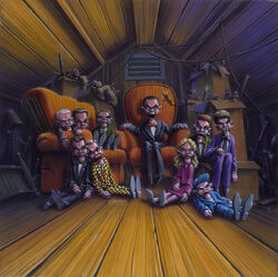
#26: Night of the Living Dummy 3
Unfortunately, our three good covers in a row streak ends here. This one is really over the top. Not a single dummy in the original art looked angry. Yeah, you had some that were frowning, but they didn't look super ticked-off. Here, every dummy looks unnecessarily ticked-off. Seriously, why are they so mad? Are they trying to look... scary? If so, they sure failed at it. I've proven that you don't need to have your villain or whoever it is to appear angry for them to look scary. When you have everyone on the cover look super angry, it just comes across as forced. If there's one thing I do like about the cover though, is the scenery. It's not too bright, but not too dark, and there's some nice detail. But overall, I do not like this cover.
 - Having all the dummies look this angry is just unnecessary and forced.
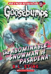
#27: The Abominable Snowman of Pasadena
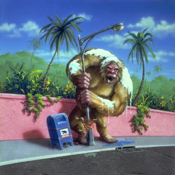
The cover is very similar to the original. You got the Abominable Snowman next to some palm trees, and tearing a lamp post. The thing that makes it different though, is the Abominable Snowman's design. Its design here is... odd. He has some balding spots, has sharp teeth, and claws on his feet. Oh, and he has white fur instead of brown fur. This is a problem, because he kind of blends into the background too well due to it. Overall, this one is meh.
 - The Abominable Snowman's design here is odd, and he blends in with the bright background too much.
#28: The Blob That Ate Everyone
In the original, the "joke" was that you got this destructive Blob Monster in a peaceful neighborhood. The Classic version more resembles a scene in the book, which I believe took place in or outside a video store. But anyway, this cover is fantastic, and my favorite in the Classic series. The design of the Blob Monster is actually scary! Yes. There's an actual cover in the Classic series I can describe as scary. Amazing. Not only that, the scenery and detail is great. The sky is actually dark for once, and there's intense lightning going on. It's beautiful. There's not a single flaw I have with it. If all the covers in the Classic series followed in the footsteps as this one, then I probably wouldn't have made this blog post.
 - This whole entire cover is excellent, and scary even. I think it's the best in the series.
Oh, but it doesn't stop there...
#29: The Ghost Next Door
A-am I seeing things? A Classic cover that's subtle and eerie? I have officially entered the Twilight Zone. No, but seriously, this one is great. So great, I prefer it to the original. I'm serious. You have this ghostly hand reaching for this creepy looking door knocker. That's it. Nothing over the top, nothing over done, nothing crazy, nothing overly exaggerated, just creepy subtlety. I also like the cool shading at the bottom.
What makes me upset though, is that this proves Brandon Dorman can make subtle creepy covers, and ones that can top the originals. Sadly, he just chooses not to, and instead goes for this very forced and over the top "angry eyes" style. But overall, I think this is the second best cover in the series. And yes, a scary cover is directly followed by a creepy cover. I'm shocked!
Also, I think I noticed something. The Classic and original versions connect. Hannah knocks on the door with the door knocker (Classic version), then Danny answers the door (original version).
 - Subtlety and simplicity is all you need to make a great, creepy cover.
#30: The Haunted Car
Annnd we're back to the over the top style. Bummer. What's interesting about this one though, is that it takes place in the woods at night. The forest scenery, background, and lighting all look nice. However, it's when we take a look at the car is when we start running in to issues. The design of it is, you guessed it, over the top and over done. Its "mouth" is open, showing razor sharp fangs, and its exhaust pipes are releasing fire. Geez. Honestly, if the fire weren't there, I would probably like this cover as a whole.
Also, this one isn't that un-scary. The car's headlights, and the forest and lighting look a little creepy. If the car wasn't so exaggerated looking, this one would have been pretty good.
 - The forest and lighting look great (a little creepy even), but the design of the car is way over done.
#31: Attack of the Graveyard Ghouls
The original cover for this one was great. It's very dark and cool looking, and looks like something you'd see to the cover of a Metal album. The Classic version however, is terrible by comparison. The design of the Graveyard Ghouls look horrendous. They don't even look like zombies. They look like green colored ghosts. Seriously, what is this? The graveyard setting and color scheme is nice, but the sky on the upper left is a bit too bright.
Even though I trashed this cover so far, I don't think it's bad. The designs of the Graveyard Ghouls are fine... as long as you don't compare them to the original. And I don't know why, but I sorta get a Halloween vibe from this. Compared to the original, this sucks. But on its own... it's actually pretty alright. So I'm gonna have to give this one a yellow splat.
 - A decent cover on its own, but compared to the original, not so much.
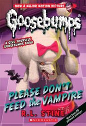
#32: Please Don't Feed the Vampire
This is the last cover in the series. Is it any good? Do we go off on a high note? Short answer: no. Here, we got an angry poodle. On the floor is her food bowl, and a chew toy (which is shaped like a bat, which is pretty cute). There's not much to say about this one. There's an angry poodle, and that's all there is too it. Too be fair, the original by Mark Nagata was like that too, but I didn't care for that version either.
Closing thoughts
Splat stats:
There were 12 covers I thought were good, 8 covers I was mixed on, and 12 covers I didn't like.
In closing, I'm not a fan of this series' artwork. It first started off completely original, then later down the line started blatantly mimicking the original series artwork. I think Brand Dorman is a great artist, but I definitely don't think this is his best work. He tried way too hard to make the artwork scary, by over doing a lot of things. However, there were some good artwork here. But those are few and far between. And some of the covers I thought were good, I didn't think were that good. So overall, I think this series is pretty mediocre when it comes to artwork (for the most part).
Top 4 best covers:
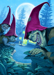
These covers are actually creepy/scary, and don't mimic the original art. Pretty much what a majority of the Classic series should have been.
Top 4 worst covers:
These covers are not creepy/scary, and mimic the original art. Pretty much what a majority of the Classic series was, unfortunately.
Other reviews:
- Coming soon.
